Prerequisites
Before proceeding we recommend you to install the latest version of Visual Studio and Xamarin.Forms.
Installation
Select your .NetStandard project and install eliteKit NuGet package as shown below.
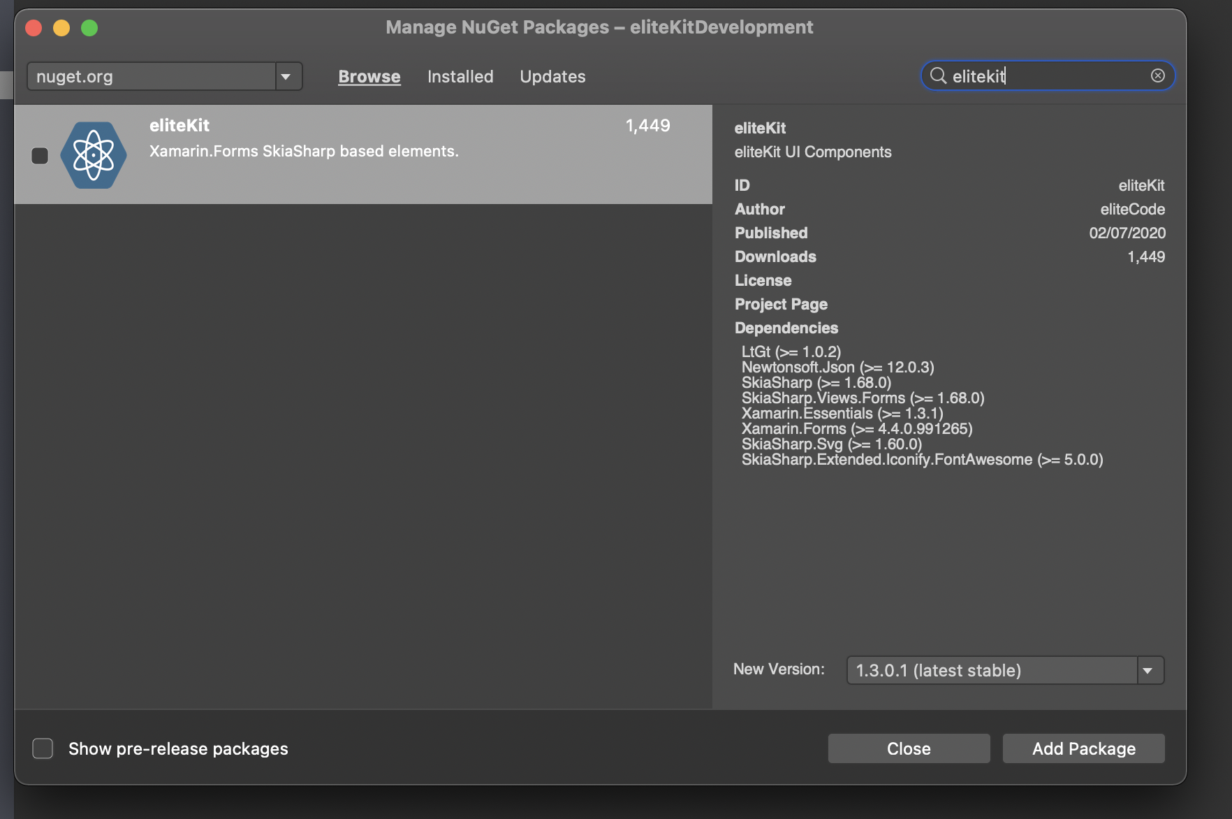
That's it!, no native initialization required.
Experimental Features
Warning
If you chose to use experimental controls you have a high probability to have unexpected behaviors within your application like app crashing for no reason, so be aware.
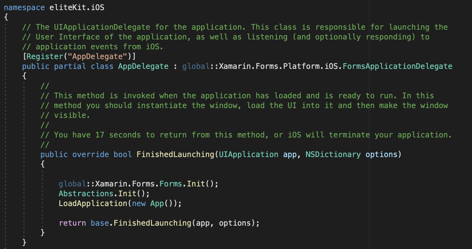
eliteKit contains some Experimental components that heavily relies on platform specific code : eliteAudio and eliteVideo.
If you want to try these please install eliteKit NuGet package into your iOS and Android proyects as well and call Abstractions.Init() on each before calling LoadApplication() as shown below. If NOT, please avoid installing this package in your native projects.
What's Next?
start exploring eliteKit.eliteElements namespace within your project. Please check the docs to see how to use and customize each control depending on your needs. Happy coding!
Properties
| CanvasData |
Provides access to Canvas SKPaintSurfaceEventArgs once it finishes drawing the initial content |
| FooterPath |
Stablishes the path to be used when drawing container shape |
| ColorPrimary |
If "IsGradient" is set to true, this property stablishes the first gradient color to use for the container background.Default is #548EC1 |
| ColorSecondary |
If "IsGradient" is set to true, this property stablishes the second gradient color to use for the container background.Default is #254867 |
| Content |
Sets the ContentView for the footer's container |
Animations
Creating custom shapes is possible by manipulating FooterPath property manually once FinishedPresenting event is triggered. It is even possible to create animations with the shapes as shown below.

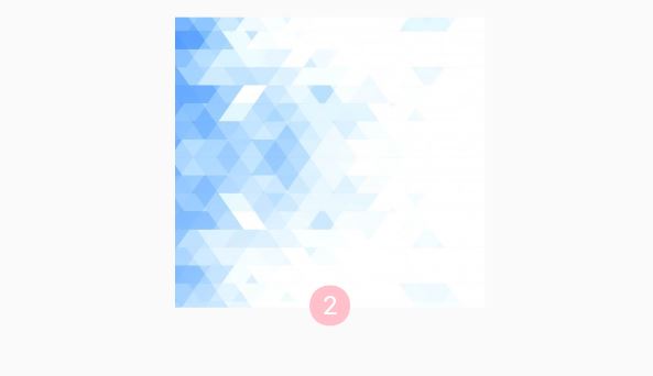
Sample
Properties
| CanvasData |
Provides access to Canvas SKPaintSurfaceEventArgs once it finishes drawing the initial content |
| HeaderPath |
Stablishes the path to be used when drawing container shape |
| ColorPrimary |
If "IsGradient" is set to true, this property stablishes the first gradient color to use for the container background.Default is #548EC1 |
| ColorSecondary |
If "IsGradient" is set to true, this property stablishes the second gradient color to use for the container background.Default is #254867 |
| Content |
Sets the ContentView for the header's container |
Animations
Creating custom shapes is possible by manipulating HeaderPath property manually once FinishedPresenting event is triggered. It is even possible to create animations with the shapes as shown below.

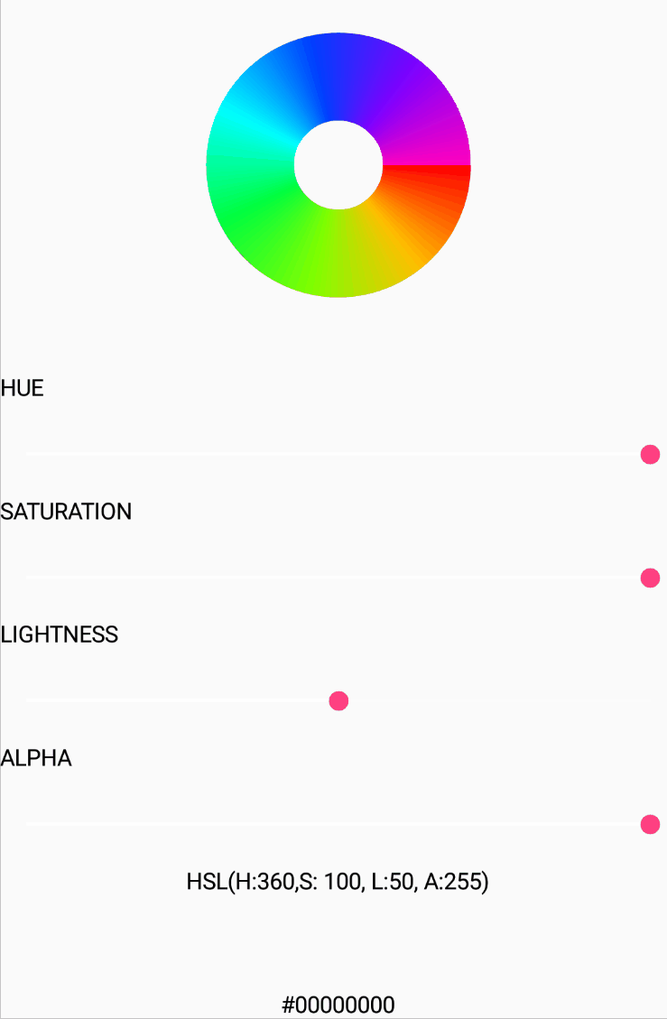
Sample